Wealth Management / Employee Experience / Data Transformation

UnifiedCX, All-in-One Platform for CX Listening

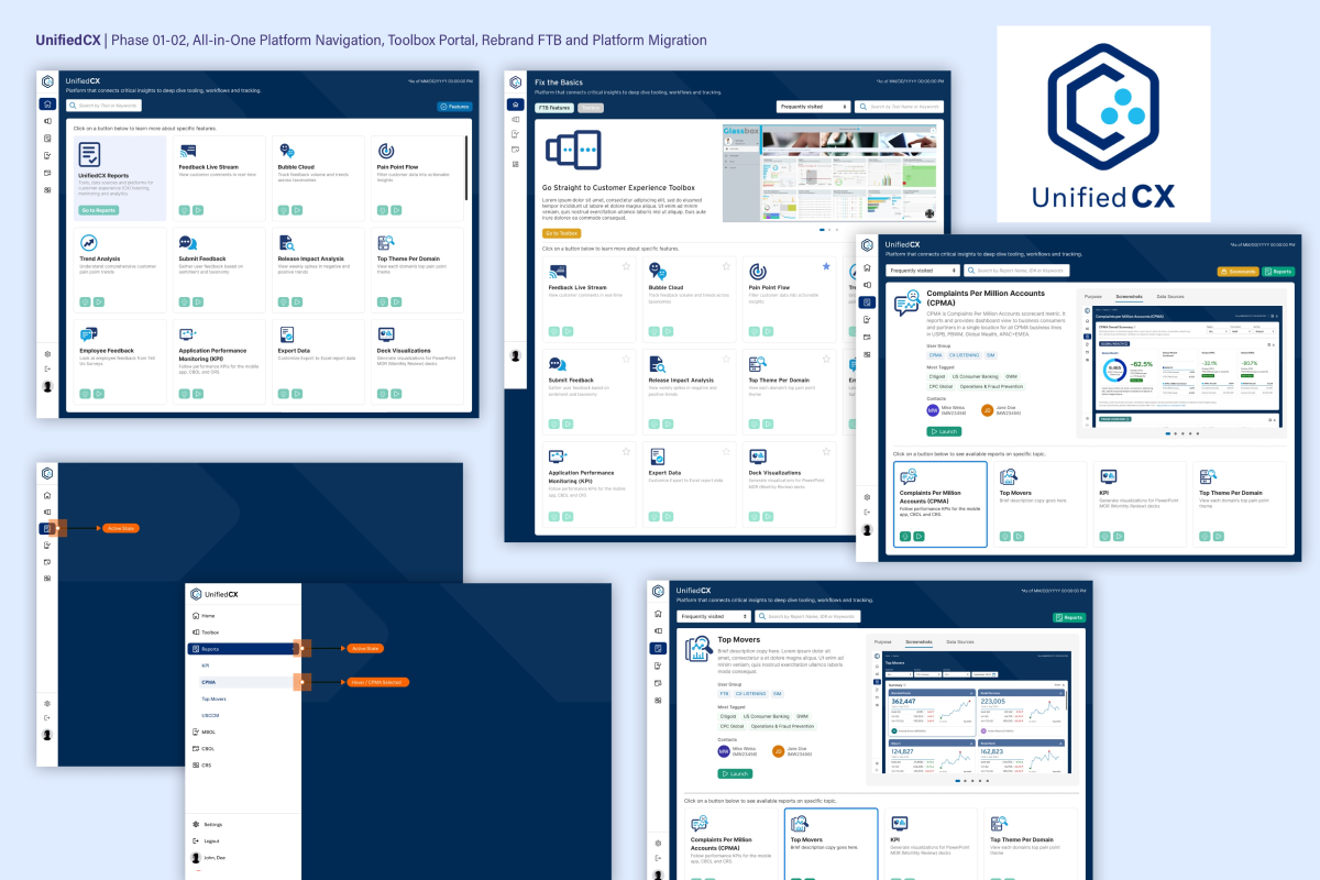
The UnifiedCX, an internal all-in-one platform replacing the legacy “Fix the Basics” workplace. Previously, CX teams pulled metrics, reports, and summaries from multiple disconnected internal and third-party tools. UnifiedCX consolidated these into a single, rebranded MVP — integrating system monitoring, performance metrics, AI-driven analytics, and Citi-approved tools for CX teams, business operations, product technology, and management.
UnifiedCX — All-in-One Platform Migration & Modernization

Client: Executive Management and Risk Managers at Citi

Role: Lead Designer & UX/UI Strategist

Audiences: CX, Business Operations, Data Management, Product Technology 

Phase1-3: Oct 2022 – June 2023 (scaled through 2024)

Problem Statement: CX teams relied on the legacy “Fix the Basics” workplace, pulling metrics and reports from multiple disconnected internal and third-party tools — a fragmented workflow that slowed reporting and obscured system health. As sole designer, I led the 0-to-1 design of UnifiedCX, rebranding the MVP pattern library and creating new logo identity while consolidating tools, monitoring, and AI-driven analytics into one system.

Process: Research and IA, wireframes, prototypes, dev handoff; new logo/identity system applied across internal platforms.

Outcome/Impact: Replaced a fragmented, multi-tool workflow with a single consolidated platform for CX teams, business operations, product technology, and management. The new Toolbox landing page centralized access to internal and third-party approved tools, reducing time spent locating reports and resources. The rebrand and navigation framework built for Fix the Basics became the direct foundation for this platform, and was fully retired once UnifiedCX was live. The platform architecture and brand identity scaled to support feature expansion through 2024.
Scope & Platform Growth: I led the design of the UnifiedCX MVP from the ground up, then carried it through Phase 1–3 (2022–2023), adding the Toolbox landing page, CPMA reporting, and TopMovers. The project also included migrating and reskinning dashboards inherited from the legacy Fix the Basics workspace — minor UI enhancements to align each dashboard with the new DViz (Data Visualization) Design System, rather than full redesigns. A custom set of premium icons, shown here as part of the Process Artifacts, was created as part of this rebrand exercise.

Complaints Per Million Accounts (CPMA) Report

UnifiedCX CPMA Dashboard

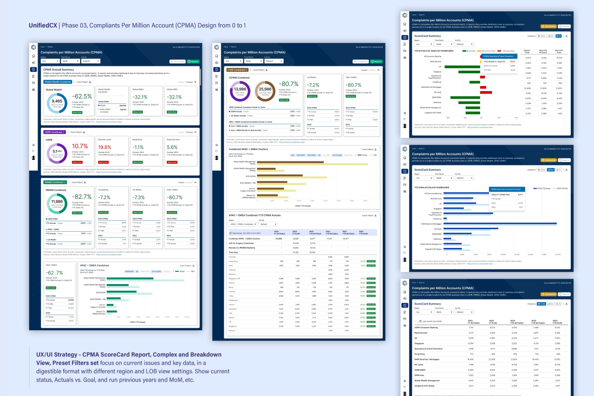
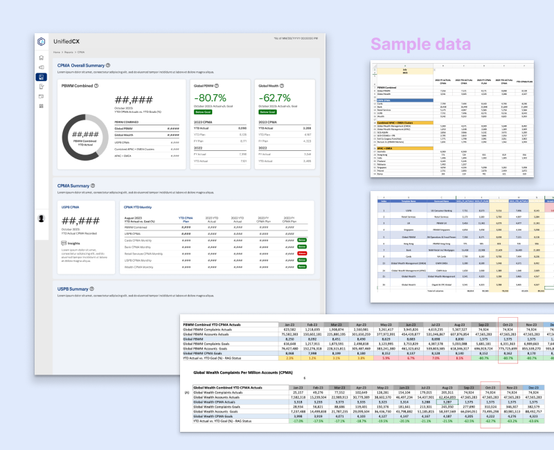
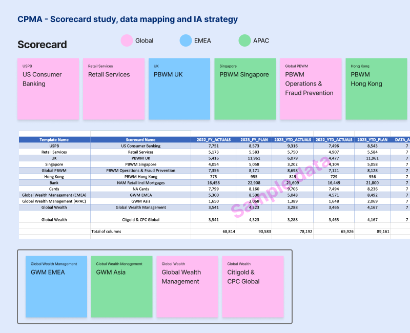
Problem Statement: Complaint data across sectors, product domains, and regions was complex and heavily negative-trend focused, making it difficult for CX and business teams to quickly identify critical issues or benchmark performance against goals. I structured this complexity into a ScoreCard-driven dashboard with preset filters, region/LOB views, and actuals-vs-goal tracking.

UnifiedCX — Complaints Per Million Account (CPMA)

Role: Lead Designer & UX/UI Strategist

Audiences: CX, Business Operations, Data Management, Product Technology

Released: June 2023

Process: Card sorting, data storytelling, IA, wireframes, prototypes, dev handoff, UAT review.

Outcome/Impact: Gave CX and business teams a single, digestible view of complaint trends instead of scattered raw data, letting them move from high-level trends to actionable detail more efficiently. The ScoreCard highlighted current concerns and trending topics at a glance, with month-over-month tracking supporting faster prioritization across sectors and regions.

Tasks & UX/UI Strategy

Dashboard & Operational Insights Designed to surface negative performance data clearly — enabling teams to deep dive into business impact, analyze attributes, and compare actuals vs. goals across sectors and regions.

Complex View & Preset Filters Preset filters and Comparison View give users full control over data visualization. Quick Summary supports seamless switching between group and individual high-level data views. 

View Settings & Inline Editing Complex View enables detailed breakdowns with user-level controls, including editable assigned items, action comments, and note uploads directly within the report. 

CPMA ScoreCard Highlights current concerns, trending topics, and critical issues at a glance. Users can select specific operational areas and compare performance across current and prior fiscal years with MoM tracking. 

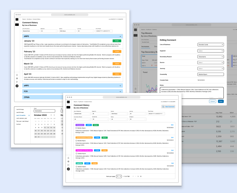
UnifiedCX TopMovers Dashboard

UnifiedCX — TopMovers

Role: Lead Designer & UX/UI Strategist

Audiences: CX, Product Technology, Operation, Risk Managers

Released: June 2023

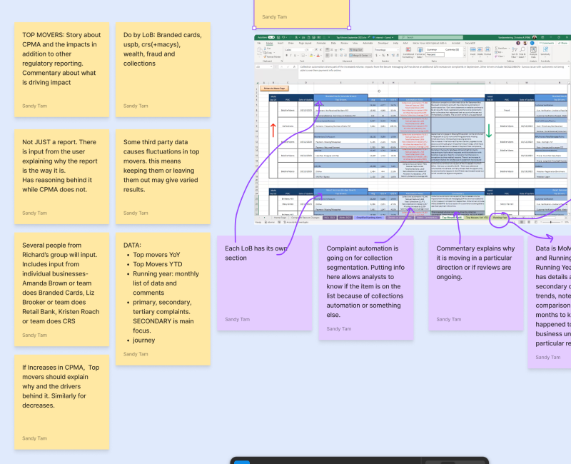
Problem Statement: Management needed a consolidated way to track trending issues, status updates, and root causes across regional lines of business and sectors, without piecing together fragmented high-level and granular data separately. Using card sorting and data storytelling, I structured this multi-level trend data into a single tool blending automated reporting with deep-dive investigation.

Process: Research and data mapping, IA, wireframes, prototypes, dev handoff, UAT review.

Outcome/Impact: Enabled management to move from surface-level metrics to secondary and tertiary root-cause analysis in one consolidated view, rather than assembling data manually across sources. The layered drill-down structure supported faster identification of top complaint drivers and status tracking across LOB and region.

Tasks & UX/UI Strategy

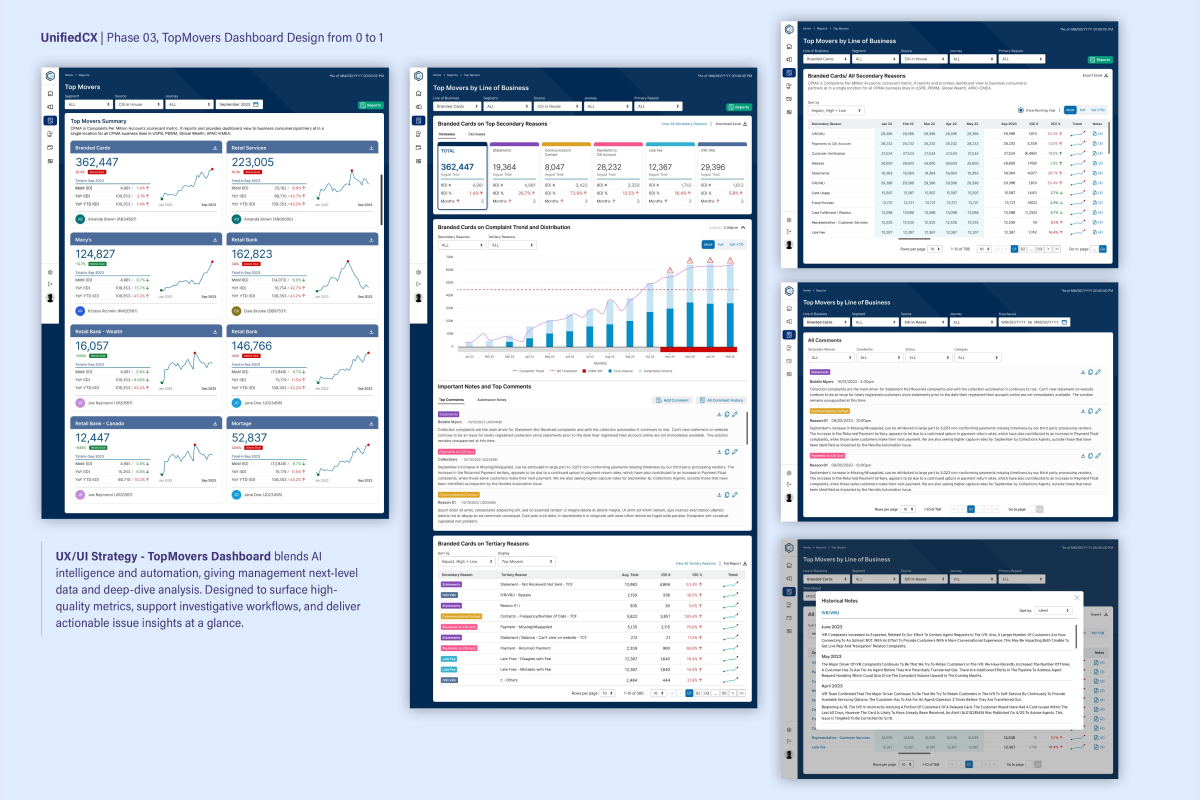
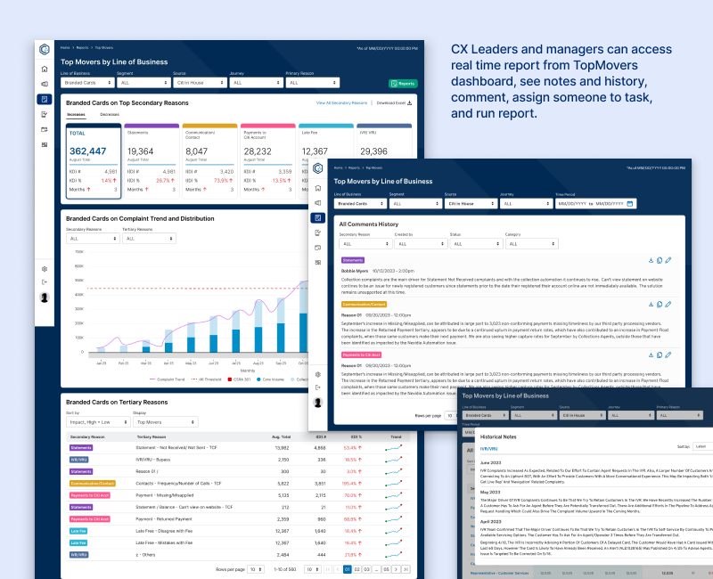
Comprehensive Trend Analysis Surfaces key metrics, trending topics, and status updates across LOB impact levels, regions, and sectors. Users can filter by time range, review actionable items, and run automated reports to support strategic decision-making. 

Deep-Dive Analysis Enables methodical investigation of top complaint drivers — analyzing secondary and tertiary factors to uncover root causes and surface targeted resolution insights. 

TopMovers Summary Highlights secondary complaint trends across data sources with inline comment editing, status updates, and layered drill-down into tertiary reasons for deeper investigation. 

Before UnifiedCX

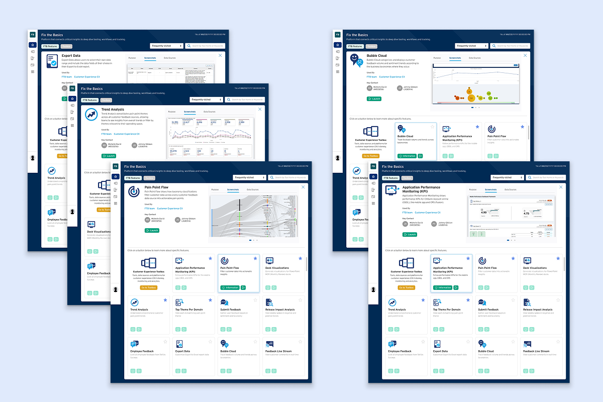
Fix the Basics (FTB) Dashboard Redesign

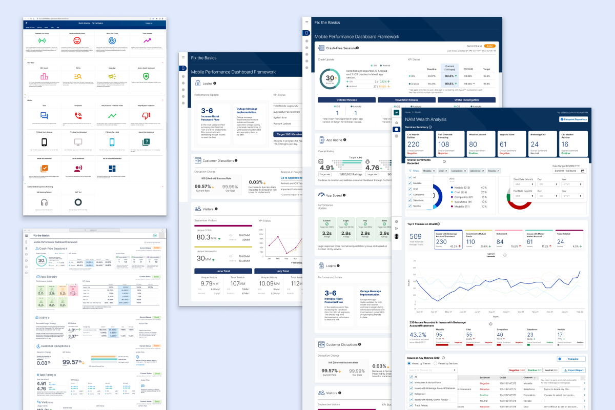
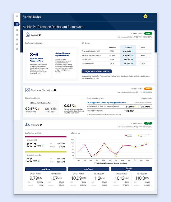
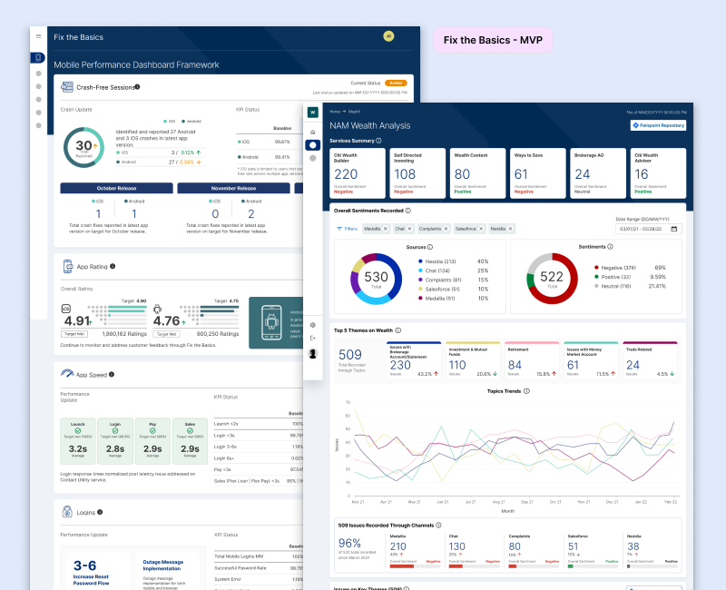
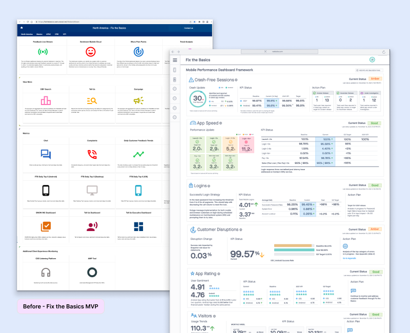
Before UnifiedCX existed, I designed and enhanced two flagship dashboards within Fix the Basics: a Framework Performance dashboard tracking operational health across CBOL and MBOL, and an Impact/Wealth dashboard surfacing customer sentiment and feedback trends. Built as flexible, self-serve tools for tech, product, and business stakeholders, these dashboards established the filtering, trend-tracking, and deep-dive patterns that would later scale into UnifiedCX.

Fix the Basics (FTB) MVP and Enhancement 

Client: Executive Management and Risk Managers at Citi

Role: Lead Designer & UX/UI Strategist

Audiences: CX, Product Technology, Data Management, Operations, Executives

Timeframe: Dec 2021 – May 2022

FTB Framework Performance Dashboard Teams needed a single, self-serve way to monitor both operational performance (app speed, crashes, login times, disruptions) and customer sentiment trends — but these lived in separate, inconsistent tools, each requiring manual digging to spot emerging issues.

FTB NAM Wealth Analysis Dashboard The redesigned the Wealth division’s customer feedback dashboard to quantify sentiment and surface key areas of concern driving business direction. Consolidated feedback from multiple sources — Medallia, chat, Nexidia, Salesforce — into one self-serve view, letting Wealth tech, business, and ops stakeholders track sentiment trends and drill into top themes and issues without leaving the dashboard. Built on the existing Wealth site structure to keep the transition seamless for users.

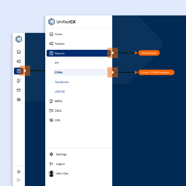
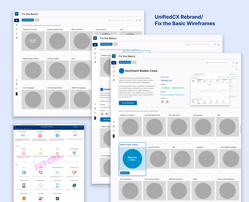
Problem Statement: FTB monitored operational health across Citi’s platform spectrum — app speed, login performance, crash rates, customer disruptions, and CX pain points — but its dashboards had grown into a sprawling, siloed set of tools with no unified structure. As FTB evolved into UnifiedCX, the platform needed a landing experience and navigation system flexible enough to hold that full breadth: active tools, dashboards slated for retirement, and new modules yet to come.

Process: Research and data mapping, IA, wireframes, prototypes, dev handoff, UAT review; Expanded navigation / IA mapping how tools and dashboards were organized by section, a retirement-vs-active feature inventory guiding what stayed in the primary menu versus the side panel, and early structural iterations of the UnifiedCX landing page.

Outcome/Impact: Led and designed both FTB and its evolution into UnifiedCX, including the platform’s landing page and expanded navigation system. The menu was built for flexibility — organizing tools and dashboards by section, accommodating features being phased out, and leaving room for new additions over time. This rebrand and navigation framework became the direct foundation for UnifiedCX: once tested and mapped against live operations, FTB was fully retired and folded into the new platform, giving executives, risk managers, and cross-functional teams in CX, Technology, Operations, and Product a single, scalable entry point into the KPI dashboards they relied on daily.
error: Content is protected !!